
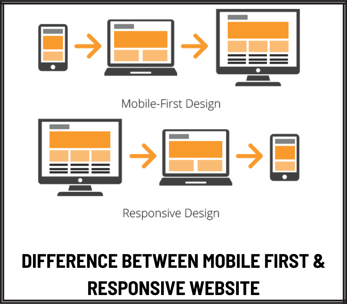
Difference Between Mobile First & Responsive Website
The landscape of website design is ever-evolving, and the two primary approaches that have emerged to meet the diverse demands of modern users are Responsive and Mobile-First. Both these strategies optimise the experience of the users across different devices. However, the strategies differ in their implementation and fundamental philosophies.
So, without wasting time, let’s dissect the dissimilarities between the two approaches.
Mobile-first Design
This design prioritises the creation of websites with mobile devices in mind before thinking of the larger screens. The approach is largely centred around the recent rise of mobile usage among users. Hence, designers find it prudent to cater to the needs of users using smaller screens.
Efficiency is one of the main benefits of mobile-first websites. Since designers are focusing on mobile devices first, the websites are created with a focus on essential features and content. This ensures a user-friendly and streamlined experience. Also, this translates into augmented performance, faster load times, and an intuitive interface.
There’s also a shift in mindset with a mobile-first design approach. Whilst designing, designers have to think critically about the content and core functionality of a website. They also have to eliminate unnecessary elements that might clutter the interface and offer an inferior experience. Due to this mindset, the result is cleaner and more concise designs.
Responsive Web Design
Responsive web design in London is on the other end of the spectrum with its flexible approach. It creates a single adaptable design that easily adjusts to various screen sizes. In this approach, designers use CSS media queries to adjust the styling and layout according to the characteristics of the device. This offers a seamless experience across smartphones, tablets, and desktops.
Responsive websites acknowledge the significance of accommodating different screen sizes without sacrificing the user interface’s integrity. Designers are able to create a consistent brand identity regardless of the device. This solution is ideal for websites with a diverse user base.
Conclusion
The choice between responsive web design and mobile-first depends on your specific business goals and user base. If you want to achieve a unified experience, responsive websites are the ideal option. But if you want your website to excel in efficiency and speed only for mobile users, mobile-first design might be the better option.
Contact NHANCE Digital for more information and to make an informed decision.